You can combine more than one chart type to create layered charts, such as overlaying a column chart with a line chart or spline chart.
Create Two Chart Layers
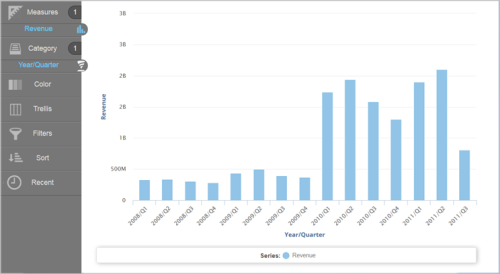
- In Visualizer,
add one or more measures and attributes to plot a chart.
- Add a measure and specify a different type of chart. Visualizer creates the line layer.
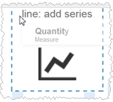
Each measure tab displays an icon to indicate its chart type.
 Tips:
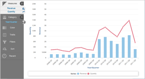
Tips:- To change the line chart to a spline chart, click the tab with the Line icon then select spline from the list of chart types.
- If your chart has more than one axis, you can click Merge Axes to combine the axes into one. If the scales are too different (as in this case), merging the axes may not produce desirable results. To split a merged axis, click Split Axes.
- Click Save.